How do you pick the right colors for your coloring pages? How do you create a pleasing balance with colors, and convey different emotions and meanings?
The answer lies in color theory—the art and science of understanding how colors interact and impact our perception. In this blog post, let’s delve into color theory basics, including the color wheel, primary, secondary, and tertiary colors, complementary, analogous, and triadic color schemes, and warm and cool colors. We’ll also showcase examples of coloring pages using different color schemes and how they influence the images’ mood and meaning.
What is Color Theory?
Color theory studies how colors interact and affect our eyes and brains. It helps us create appealing color combinations and comprehend the psychological and emotional effects of colors.
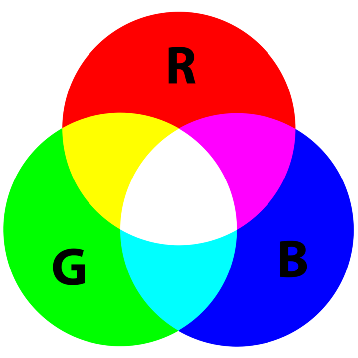
A crucial tool in color theory is the color wheel, a circular diagram depicting color relationships. It’s based on three primary colors: red, yellow, and blue, which can’t be formed by mixing other colors. Combining two primary colors gives us three secondary colors: orange (red + yellow), green (yellow + blue), and purple (blue + red). Mixing a primary color with a secondary color results in six tertiary colors: red-orange, yellow-orange, yellow-green, blue-green, blue-purple, and red-purple.
The color wheel aids in forming various color schemes—sets of colors that harmonize. Three basic types include:
- Complementary: Opposite colors on the wheel, like red and green. They create contrast, making each other stand out, ideal for dynamic and energetic coloring pages.
- Analogous: Colors next to each other on the wheel, such as blue-green, green, and yellow-green. These colors blend well, producing calm and soothing coloring pages.
- Triadic: Three evenly spaced colors on the wheel, like red, yellow, and blue. They create balance and variety, perfect for vibrant and lively coloring pages.
Colors can also be classified by temperature: warm or cool. Warm colors (red, orange, yellow) evoke excitement and energy, while cool colors (blue, green, purple) evoke calmness, relaxation, or a touch of sadness.
Read also: How to Color Like a Pro: Tips and Tricks from Expert Colorists
How to Apply Color Theory for Amazing Coloring Pages

Now that you’ve grasped the fundamentals of color theory, let’s explore how you can use it to craft stunning coloring pages that mirror your mood and style. Here are practical tips and examples to spark your creativity:
- Choose a fitting color scheme: Tailor your color scheme to your desired ambiance. For bold and dramatic, try complementary colors. For peace and harmony, experiment with analogous colors. If you’re aiming for a fun and playful vibe, a triadic color scheme could be the perfect choice.
- Play with shades and tones: Experiment with brightness, darkness, and saturation. Adjusting these elements can create various effects. For instance, pastel tints of complementary colors can offer a soft and romantic feel, while dark shades of analogous colors can exude richness and elegance.
- Balance with warm and cool colors: Leverage warm tones for attention-grabbing elements or positive emotions. Incorporate cool colors for depth, perspective, or to express more subdued feelings. Combining warm and cool hues can bring balance and intrigue to your coloring pages.
- Explore patterns and textures: Add detail and variety with patterns and textures. Use dots, stripes, swirls, or flowers to fill different areas. Experiment with tools and techniques to create diverse textures with your chosen coloring medium—smooth shading with pencils or crisp lines with markers.
Coloring Page Examples with Different Color Schemes
Here are examples to inspire your use of color theory in coloring pages. Find these pages and more on our website for free download and printing:
- Complementary Color Scheme: Red and green create a striking contrast and festive mood. Red flowers stand out against a green background, while green leaves add balance. Yellow accents introduce brightness and warmth.
- Analogous Color Scheme: Blue-green, green, and yellow-green produce a soothing and natural look. The colors blend harmoniously, creating a sense of calmness. Blue accents contribute depth and coolness.
- Triadic Color Scheme: Orange, green, and purple result in a lively and playful appearance. Balanced and varied colors evoke a sense of fun and energy. Pink accents infuse sweetness and warmth.
We hope this guide has empowered you to apply color theory confidently, enhancing your coloring pages. There’s no right or wrong way to color—enjoy the process, express yourself, and let your creativity flow!