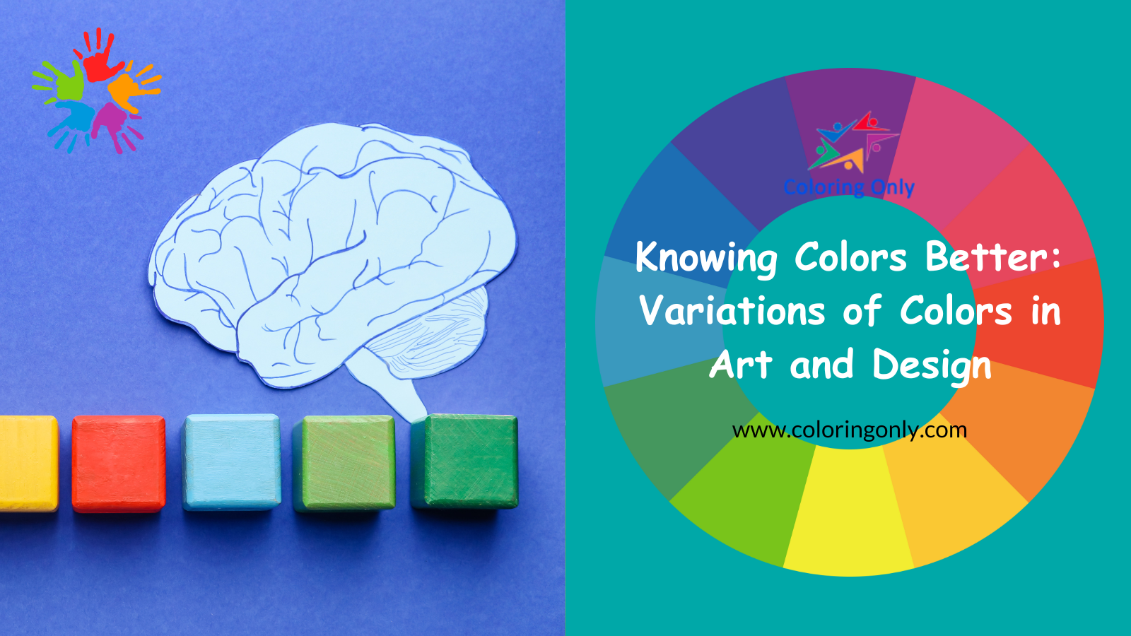
Knowing color terms is essential. It not only enhances our understanding of how color functions in art but also equips us with the vocabulary needed to discuss and critique artistic and design works. Let’s delve into some important color terms that every artist and designer should be familiar with.
Color Tints

A tint is a color mixed with white. This makes the color lighter. Tints make designs and paintings feel light and airy. By adding white, we get different tints that create various moods. Tints are useful for artists.
Color Shades

A shade is a color mixed with black. This makes the color darker. Shades add depth, shadow, and contrast to art and design. Using shades can make a piece look more dynamic and dramatic.
Color Intensity

Color intensity or saturation, shows how strong a color is. Mixing a color with its complement, black, white, or gray, can change its intensity. Bright colors are high-intensity, and muted colors are low-intensity. Knowing how to change color intensity helps create interest and focus in art.
In our example, three violet rectangles look different next to various colors. This is called Simultaneous Contrast, showing how nearby colors affect intensity.
Transparent Colors

Transparent colors let light pass through, allowing us to see layers beneath. Watercolors often use this technique. Transparent paints can be layered to create rich effects. Overlaying two transparent colors mixes them into a new color. This is called a color wash in watercolor or a color glaze in oil and acrylic painting.
Some paints are naturally more transparent. Transparent colors add depth and glow to a painting.
Opaque Colors

Opaque colors do not let light pass through. These colors are thick and cover well. Oil, acrylic, and gouache paints are usually opaque. Opaque colors can cover other paint layers completely.
Artists add titanium white to make transparent colors opaque. Knowing how opaque different colors are helps in achieving the right effects.
Warm and Cool Colors

Warm colors like red and yellow are stimulating. They remind us of fire and sunlight. Warm colors stand out and move towards the viewer in a composition.
Cool colors like blue and green are calming. They remind us of ice and water. Cool colors fade into the background, creating depth.
Understanding warm and cool colors helps create balanced compositions. In landscape painting, warm colors bring objects forward, and cool colors create distance. This technique is called Aerial Perspective.
Tone

Tone shows how light or dark a color is. Adding gray or changing its value creates tone. The tone is used to show light and shadow, making the artwork look three-dimensional. Mastering tone helps artists create realistic images with depth.
Matt and Gloss Colors

Matt colors are dull and non-reflective. Gloss colors are shiny and reflective. Artists can change the shine of their paints with mediums like turpentine or linseed oil.
Balancing matt and gloss effects adds visual interest. Many artists use a matt or gloss varnish to finish their work, protecting it and unifying the surface.
Monochrome and Polychrome Color
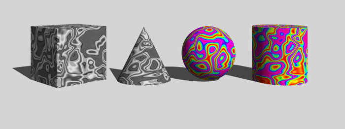
Monochrome uses one color or shades of one color in a composition. This creates harmony and cohesion. Monochrome art relies on tone and intensity variations for depth.
Polychrome uses multiple colors. This technique creates lively and dynamic art. Polychrome relies on color contrast and harmony for impact.
Knowing color terms is crucial for art and design. From using tints and shades to balancing warm and cool colors, each aspect of color theory helps create expressive art. By mastering these terms, artists and designers can better communicate visually and emotionally.

